Finding Your Way: Why Wayfinding Signage is More Important Than You Think
- Alexandra Duncan
- Sep 9, 2018
- 2 min read

Updated: Nov 27, 2018
A quick look through the Paul J. Leonard Library might turn into a winding maze. Let's talk about the importance of wayfinding signage.

Wayfinding Signage and Why it's Important
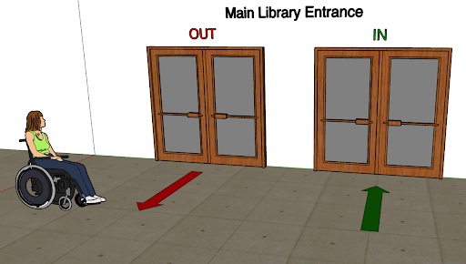
Imagine this: It's your freshman year, it's 1 p.m., you've just finished up your class so you decide to go over to the library to get a head's start on an assignment. You know where the library is, of course, but you've never noticed any signs saying how to get to the library from your class. You walk up the stairs to the the main floor and a swarm of students come in and out of the entrance. Doors are wide open but no arrows give you direction to show which door is in or out. It's utter chaos. You slowly walk in so as not to crash into someone, but a student walks into your path. You make direct eye contact and you go right, but she goes left. Then it happens again. You're doing that weird dance where you guys keep getting in each other's way. Traffic is slowly building behind you and the torture never seems to end! You say "excuse me" and you finally get out of the way. Phew! You made it. Imagine that experience, except it happens EVERY. TIME. Now imagine a solution. Proper wayfinding signage that is clear and concise could easily rid library-goers of this problem and others like it. But how?
Wayfinding Signage: A Solution to the Crashing Problem
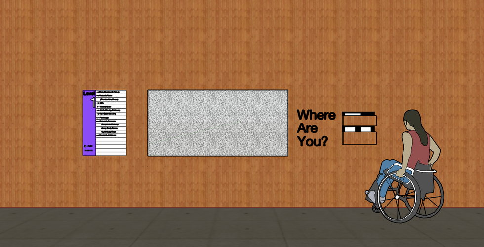
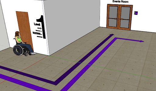
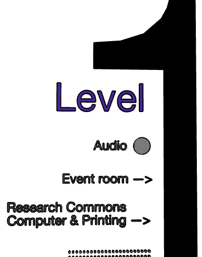
Through research and observation for my design process class, I've come to find that a lot of the signage on campus is inconsistent, not extremely visible, unappealing and, there's just not enough of it. The assignment for my design class was to recreate the wayfinding signage in the SFSU library. My classmate and I decided to go for modern signage by using simple black and white contrast, Helvetica Neue font and illuminated signage for added visibility. Enjoy the pictures and tell me what you think.
I've also included a link to the pinterest board I gathered for inspiration for this project. Take a look at it here.
Thanks for reading!


Alex is a technical writing major with a focus in multimedia and a minor in Africana Studies.


Comments